Corporate Work
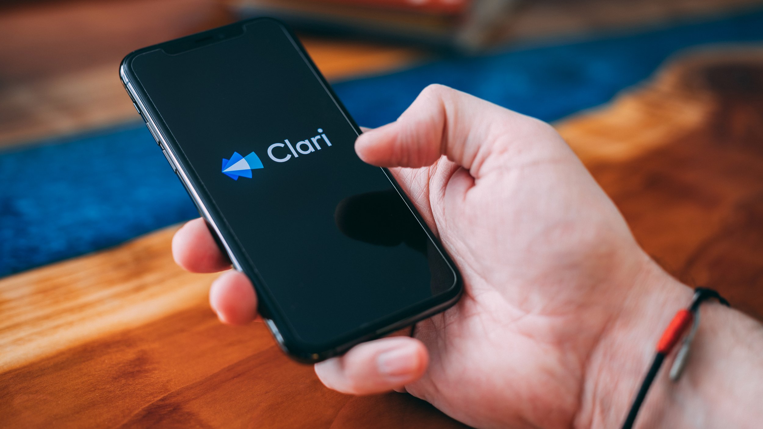
CLARI REBRAND

Clari is a sales and revenue software company founded by Venkat Rangan and Andy Byrne in 2013 and is headquartered in Sunnyvale, California. Their products automatically capture, sync, and update data to give its users a clean, current foundation for their sales and revenue teams to work smarter and close more business.
At the beginning of 2020, however, it became clear that the company’s visual identity was not reflective of the modern tech giants’ innovative products, and a rebrand was put into motion.
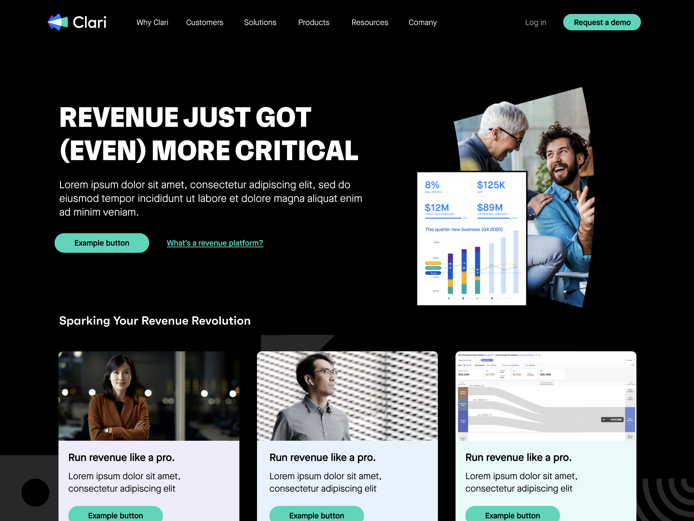
From


To


The Brief
Requestor: Marketing lead program. CMO owner with estaff buy-in and approval
Timeline: 6 Months
Goal: Showcase Clari as the leader they are by breathing new life into their visual brand and voice
Contributors: GoldFront Agency, Clari internal teams
Process
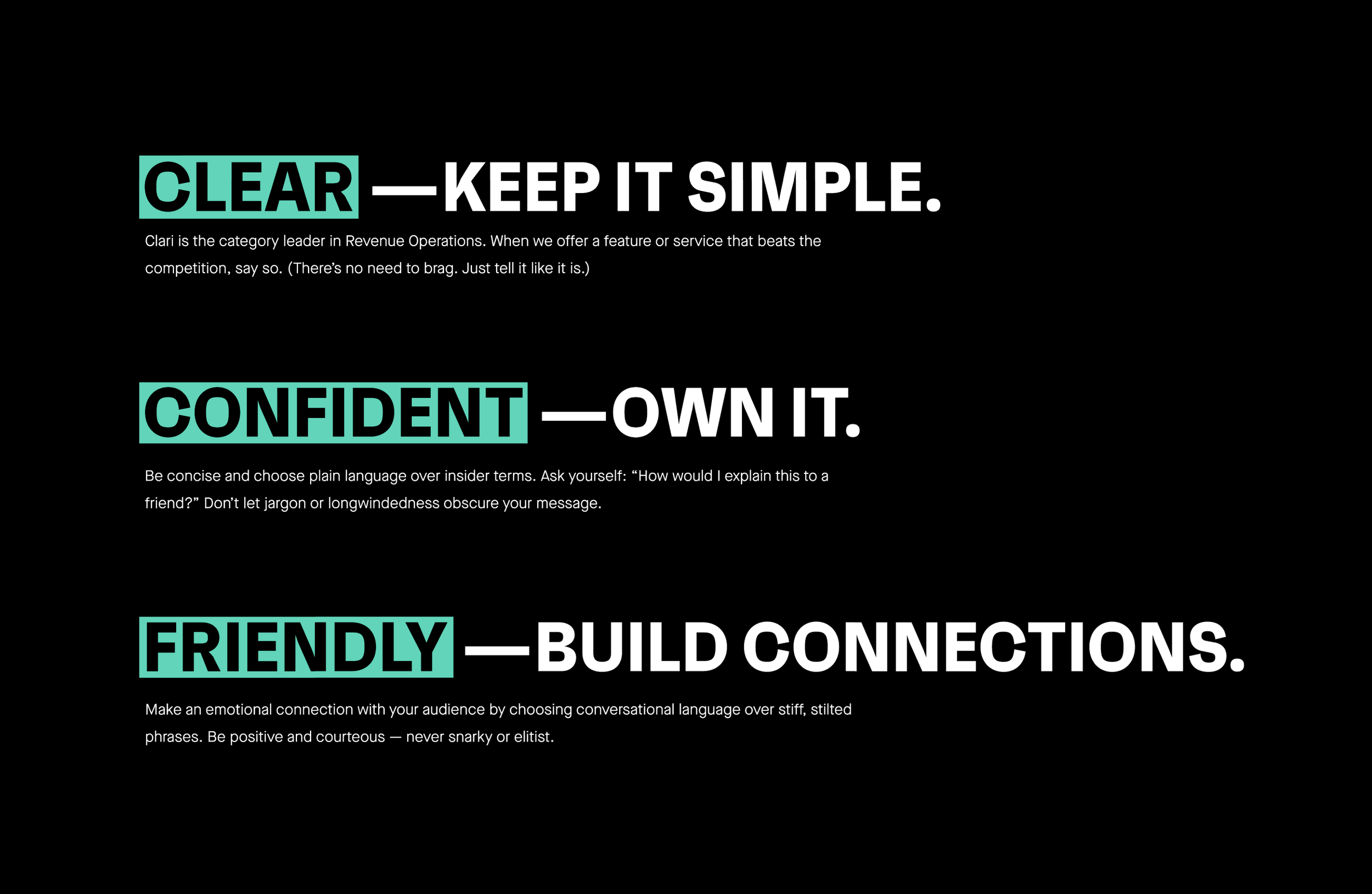
Internally there was myself and 1 senior designer, Jessica Louie, and we worked with several external agencies providing direction and production support in this project. The company was founded in 2013 and was still leveraging the branding created from its inception. The goal was to re-envisioned the company in a way that stood out in the market, was modern, and carried the same attitude and energy that its products gave to their customers. This involved a lot of cross-collaboration with numerous contributors from executives all the way down to every day contributors which made this no easy task.
I was brought onboard right as the project kicked off so the process for vetting and agency had already been taken care of and we went with a killer company based out of San Francisco called Goldfront. Josh who is the lead for the project was awesome and was able to keep us on track and under budget throughout the process. A lot of the creative iterations that took place on the agency side was then pitched to the creative team at Clari for us to provide critique and design direction for every new element of the brand that was created. Internally there was only three visual designers and two copy-writers as well as a number of senior leaders with buy in. With such a small team it would have been impossible for us to execute a full companywide rebrand in that amount of time.
Our process was simple:
Step 1: Identify who needed to be involved and when. Kick off call with them to get full alignment and buy in from the top down. I cant stress how important this step is. If anyone involved in the project is even a little unclear on thier roles and responsibilities and the expectaitons around when and when not to provide feedback and approvals, it will all fall apart.
Step 2: Identify our core, foundatinal elements and update them. IE: Logo, Type faces, Color pallete, Voice, stc.
Step 3: Then list out all the assets needing to be reskined and what could stay in legacy branding. IE: collateral, signage, swag, etc. We created tabs in an excel sheet for every category and then listed out what needed updateing and who was responsible for each item.
Step 4: Build/execute while providing ample time for feedback and collaboration from the top down.
While this is a drastic over simplification of the process, this was the method we used and by having clear ownership and responsibilites identified from the begining and a great project manager at the agency keeping us on track we were able to hit our original deadline/launch date.
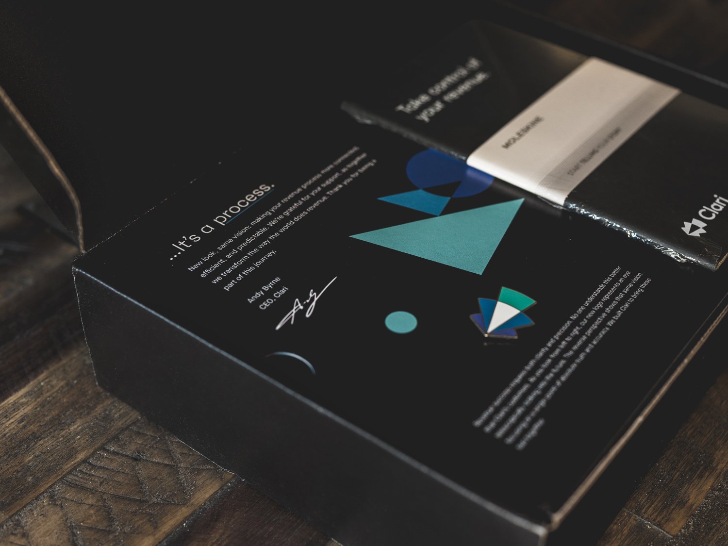
Make A Splash
Once it was all ready to go we made a huge splash internally but also on all of our social channels. And while visuals were/are important, the message needs to resonate so Isaac Horton made this cool video to reinforce our vision with the new look.